D+ APP SPLASH PAGE
 SCREENSHOT.PNG)
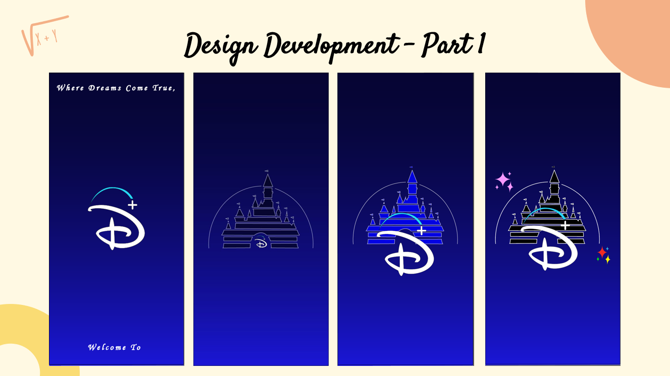
The inspiration for this app icon was from Disney+, as you can see from the colors and design!
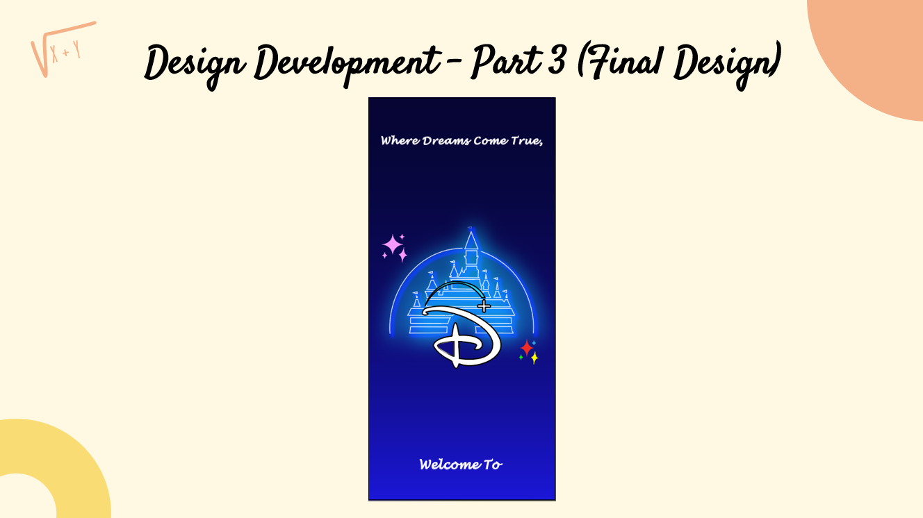
- The issues I see in this splash page design, I felt it lacked a more magical feel and a historic or relatable design element.
- To fit the theme of fantasy. I made use of Walt Disney’s Tagline and used Sparkles to give it an extra touch as well.
- Using the Mickey Mouse Clubhouse Colour Palette, the colours that are found in the logo are red, blue, green, yellow, white, and pink to represent Minnie mouse.
- I also wanted to honour Mickey Mouse being the first Disney Character created.
- For the background, I wanted a darker blue color which leads to a slightly lighter blue, hence, creates a gradient. As the blue on the original Disney+ splash page gradient ends with more of a whiter color.
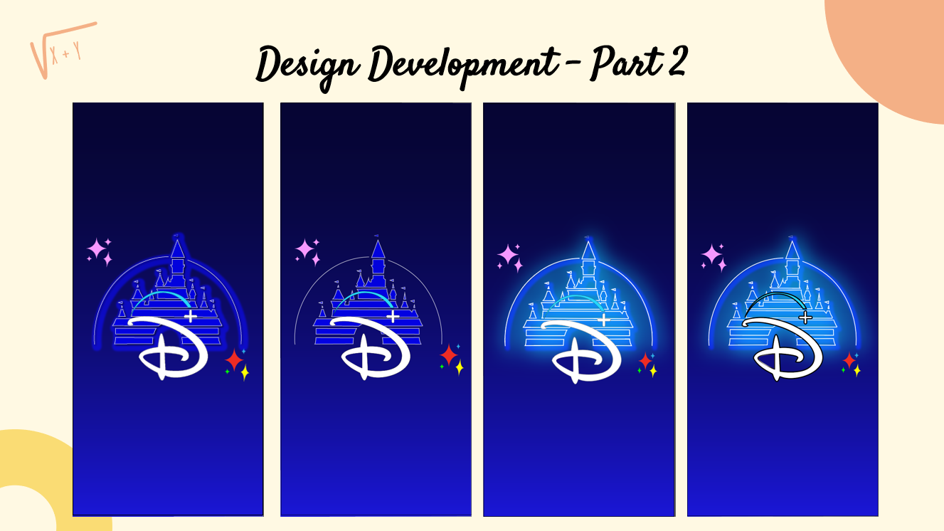
- The castle’s glowing effect from the light blue allows for the castle to pop, making it direct the consumers eyes to the center.
- My meaning for the castle was to show the origin and to remind viewers how far Disney has come and to what we have today, Disney+, featuring content from various major film companies.
Design Development - Part 1
Design Development - Part 2
Design Development - Part 3